Screen Elements in the Dispatch Module
Screen Elements

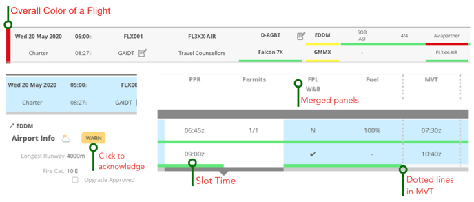
Each Flight is displayed as a horizontal flight strip with color indications. It resembles a checklist, that starts out all red, and is turned yellow and green progressively as the flight preparation is accomplished.
To make it easy to prioritize actions, we apply a standard color scheme to all flight items:
- Grey: NA or NR
- NA = Not Applicable ~ This item is Not Applicable for this leg in this specific situation.
- NR = Not Required ~ This item is Not Required for this leg in this specific situation.
- Red: DO = Item is a not-yet-started To-Do.
- Yellow: HOLD or REQ
- REQ = Item has been Requested. Waiting for a response.
- HOLD
- ~ Item is being processed internally before a Request can be placed.
- ~ Item has been requested and answered; It is being processed internally (e.g. being checked before setting OK/green.
- Green: OK or OK-All
- OK = Item is Done ~ All Right for this specific.
- OK-All sets all services related to this leg requested via the Handler or via the Crew to OK (e.g. arrival handling, arrival transport, permission, and catering, if requested via the Handler.)
- Purple: The item may need to be Revised; Some changes in the flight occurred that potentially may affect this item. Please check and confirm by clicking the purple jelly.
Pattern Indication
Stripes = positioning flight
No stripes = passenger flight

- We want to make it 100% clear which panels determine the overall color of a flight - in Dispatch and in the Timeline. To do that we distinguish between the stages of the flight. Before takeoff, all panels from the Aircraft to Fuel are considered. If you have one red panel there, the overall color will be red. If everything is green with some yellow, the overall color will be yellow. If everything is green - you're good to go.
- After the flight, we only consider Post Flight panel.
- We indicate this change with dotted lines before and after the Movement Message.
Manual Feasibility Check
You can submit an itinerary to a manual feasibility check by clicking the Feasibility Check button in the itinerary in the Sales module, refer to The Itinerary for more information.
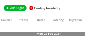
In dispatch there is a notification popping up on top of the screen, to indicate that new flights are pending a feasibility check.

Dispatchers can then do the check, and approve or decline the flight with the buttons on the right side of the flight strip. For any restrictions, the dispatchers can add a note in "Booking Notes".

'Acknowledge' Functions
- For better management of the panel colors, there is an "Acknowledge" function in various panels. For example, Maintenance may be red due to a MEL/HIL item, your assessment concludes that the restrictions do not apply to your flight (i.e. no flights into known icing conditions). You can click on the red/DO to acknowledge the warning. The panel section will then turn green for the flight, but the warning will persist.
